Midjourney Wrangler

A Day in the Life
by Peter Kaminski
These are a selection of some of the better images generated by me with Midjourney over the course of a day or so. These represent maybe 35% of the images I generated. Even though I've already put aside 65% of the images from this day, most of the images below would also be put aside (or really, kept for some future use) too, because they're "not good enough". I thought it would be interesting to share this set of good-but-mostly-not-good-enough images and write some thoughts briefly about the images that are at this curation step.
Production notes:
- The image generator is Midjourney 5.2. Most prompts were created by me using ChatGPT to produce a variety of subjects and styles.
- Midjourney generates 4 images at a time, arranged in 2x2 grids, or "quads". The following images are the raw quads, scaled down a bit for the web. It's often the case that one or two of the images are good, and the others would not be used. Sometimes raw images need a little fixing, either painting out or regenerating a small section, or tweaking the exposure. I usually use Photoshop for small tweaks, although there are other tools and workflows, too. Oftentimes it's easier to just ask Midjourney to generate another image, and discard the ones that need fixing.
- I use the word "ship" or "shippable" a number of times. To "ship" is borrowed from software product development; it essentially means "to publish".
- Midjourney's default image aspect ratio is 1:1, but it will happily accept any ratio. The docs say that any aspect ratio greater than 2:1 may produce unpredictable results (although I've not found it to). I like the "widescreen" view of 2:1, and use it primarily, unless I'm specifically looking for different framing. Another nice thing is that 2:1 is slightly wider than 16:9, which is a common publication / viewing ratio; cropping a 2:1 original to 16:9 allows some control over the framing/composition. Some of the images below are 4:3; these are images in which I had Midjourney use a photo of mine for inspiration, and the 4:3 ratio was carried over from the photo.
In the rest of the post, a quad (sometimes several quads) is presented first, with short notes about it afterwards.
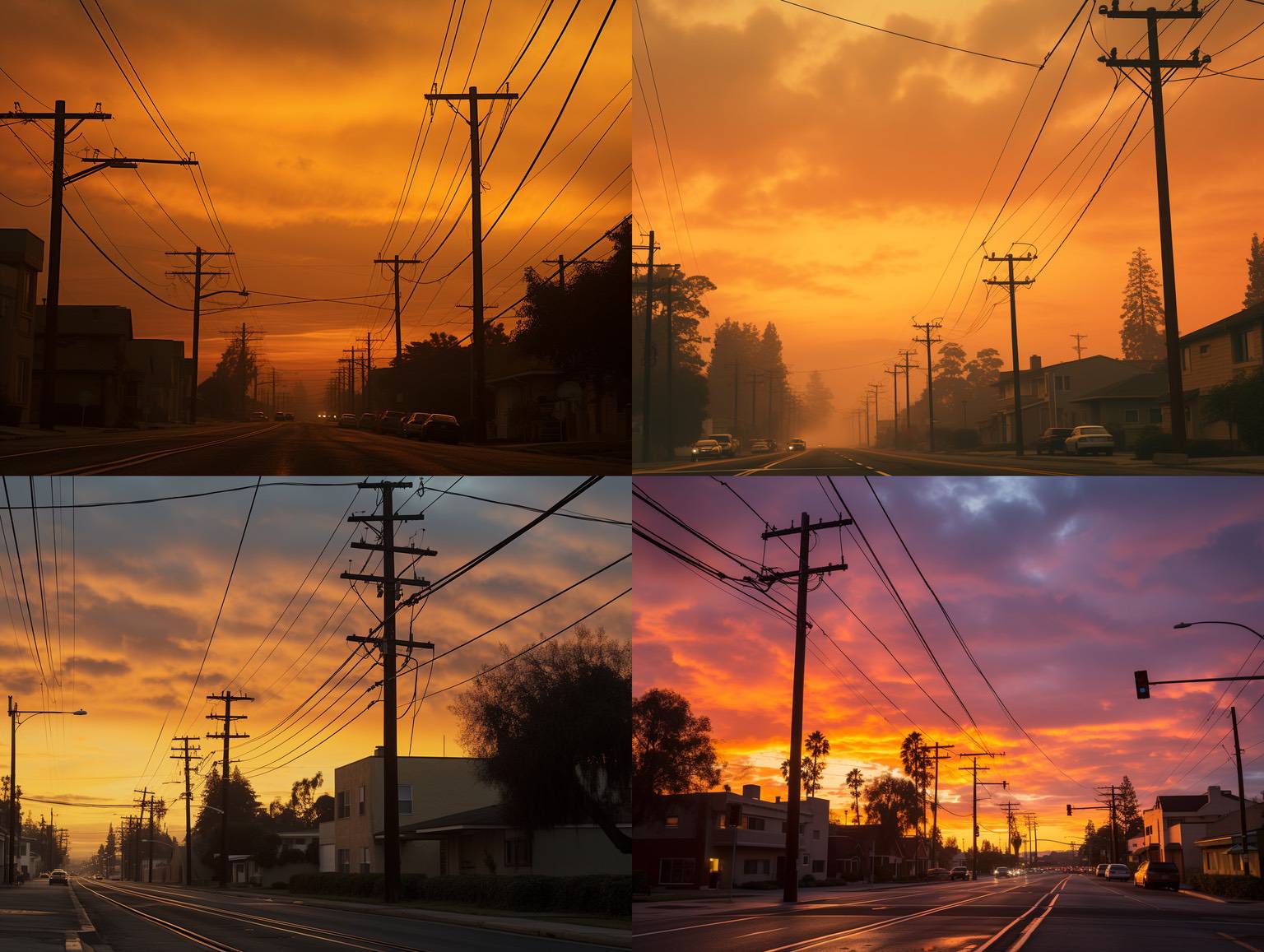
I take photos very much like these! It's sort of an "imperfect beauty" thing, where the sunset is gorgeous and then urban-ness encroaches with its wires and poles.
So, it's nice to have Midjourney synthesize a scene that I might have taken, but never did.
I like the lower-right one here. Note the wires, though, they're not connected very well! That would make it hard to ship.
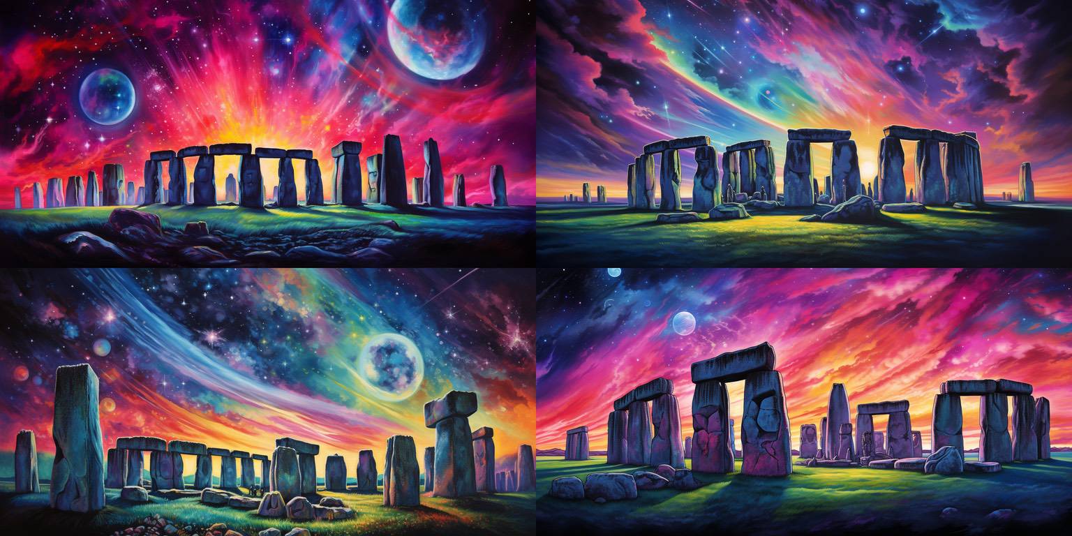
These are pretty lousy as images (amateur painting), however, I really like the vibrancy (if not the execution) of the colors in the sky. And juxtaposing Stonehenge and a psychedelic sky tickles me! Maybe there's some way to use this as inspiration for some future image.
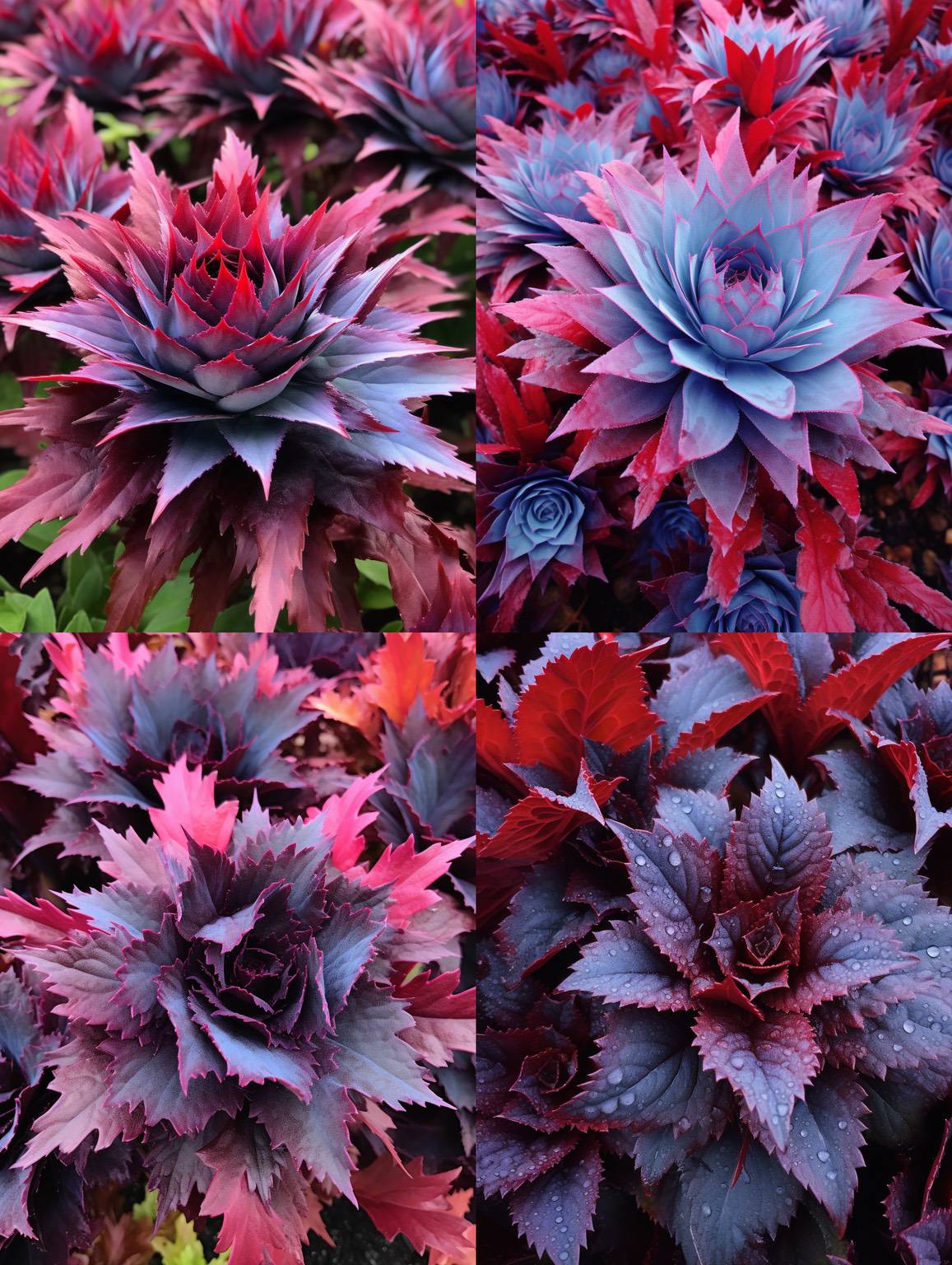
Yikes! I like the colors and spikiness. :)
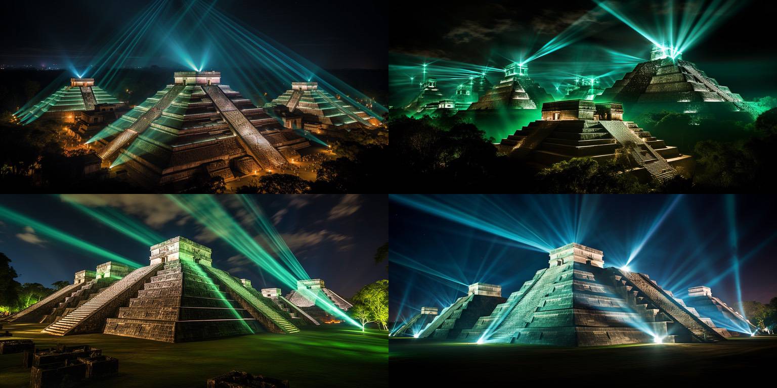
Another cool one mostly for the juxtaposition. Mayan pyramids and laser light shows, wow! (Not that I'd want to see this in real life! But I like the juxtaposition.)
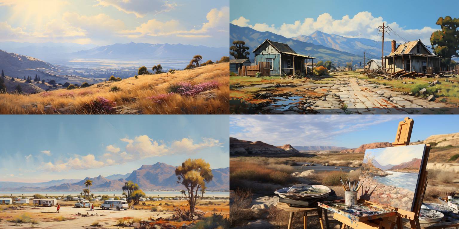
Top left is one of my favorite images of the last few days. It's even better at full scale, of course. It's very reminiscent of places I've been and love, and I love distant mountain vistas like that. The haziness of the distance, the brightness of the sun, the soft gold colors and textures of the grasses in front, the contrast of that with the colors and shapes of the mountains in the distance. I really like this one.
The others are fine, but I'd probably discard them.
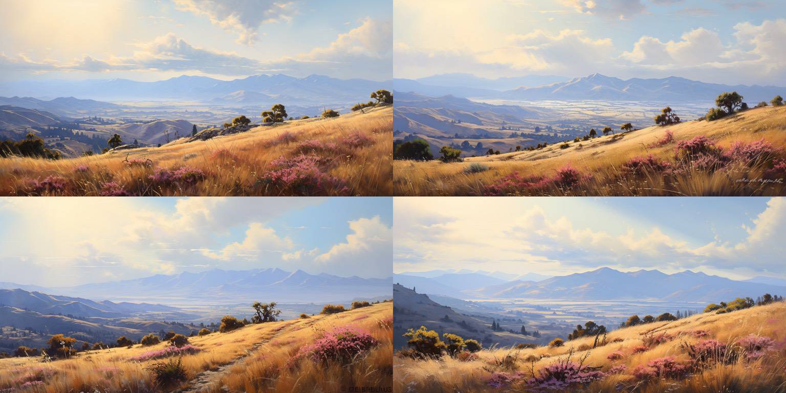
Variations of the above; I really like the footpath in the lower left one. Again, very reminiscent of places I've been and enjoyed.
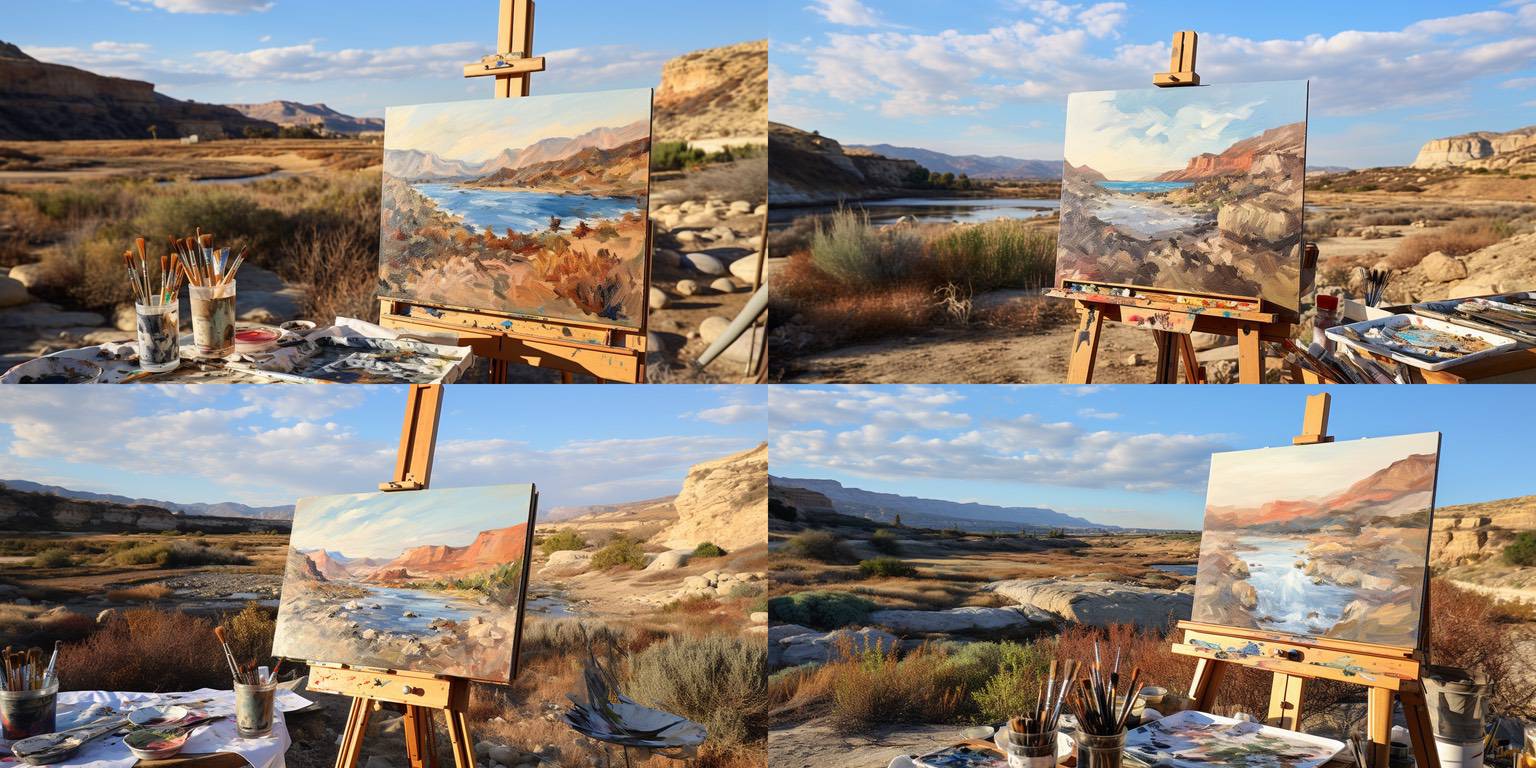
One of the things I do with Midjourney is to feed it photos I take, whereupon it creates prompts that would create similar images. Since I live in Southern California, a lot of those come back with part of the prompt being "California plein air", which to the bot means painterly, landscape-y, California plants and light, etc.
So, I tried a bunch of "plein air" prompts mixed with different locations. This quad has variations of the lower right image from the quad above that has the landscape I love. This one cracks me up because it took "plein air" literally, and created a painting done en plein air. It's interesting (and telling, I guess) that the paintings don't overly match the landscapes behind them.
Still, very pretty images – beautiful colors, sky, landscape, easel – hard to fault technically.
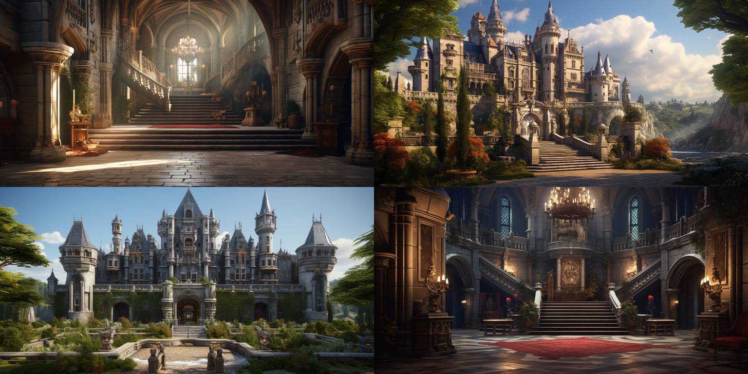
This was a "European castle" prompt, and I really love the atmosphere in the top left image. The haze, the sunlight on the floor, the depth of the shot – all really nice. It makes me think of cathedrals I love, even though the architectural layout is different from a cathedral.
There's an extraneous staircase rail at the left of the stairs, which kind of messes this up as an image to ship. Elsewhere, I painted that out with Photoshop's generative fill, which makes it shippable.
Trivia: I prepped the top two images here to be in the Plex email. (In the top right image, the bird silhouette needed fixing, and it turned out that the lighting can be improved, even though it's already pretty good.) I nixed them, though, because I thought they might convey a fascination with European imperialism and thence colonialism which I didn't want to convey – even though I mostly wanted to share them because of the atmosphere of that staircase.
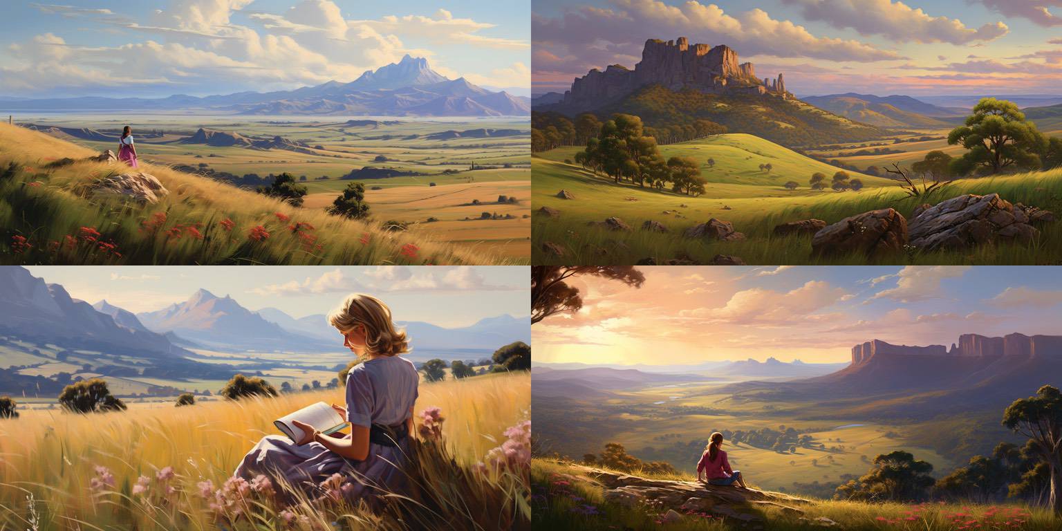
This is an example of the images that you sort through to find something better. Very pretty, technically okay but not great.
(Some of you might have seen a similar image of a young woman and a beautiful vista; these are related prompt-wise, but not as good.)
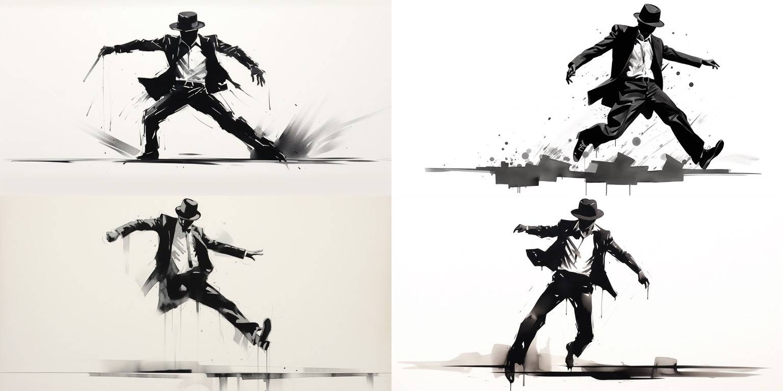
Imperfect, but I like the black/white contrast, and then the gray smudges and smears. The energy of movement is great, too, even though the geometry of it isn't very realistic.
This is one of those images that I'm glad I get to see, even though it's not good enough to share except as an example of particular things.
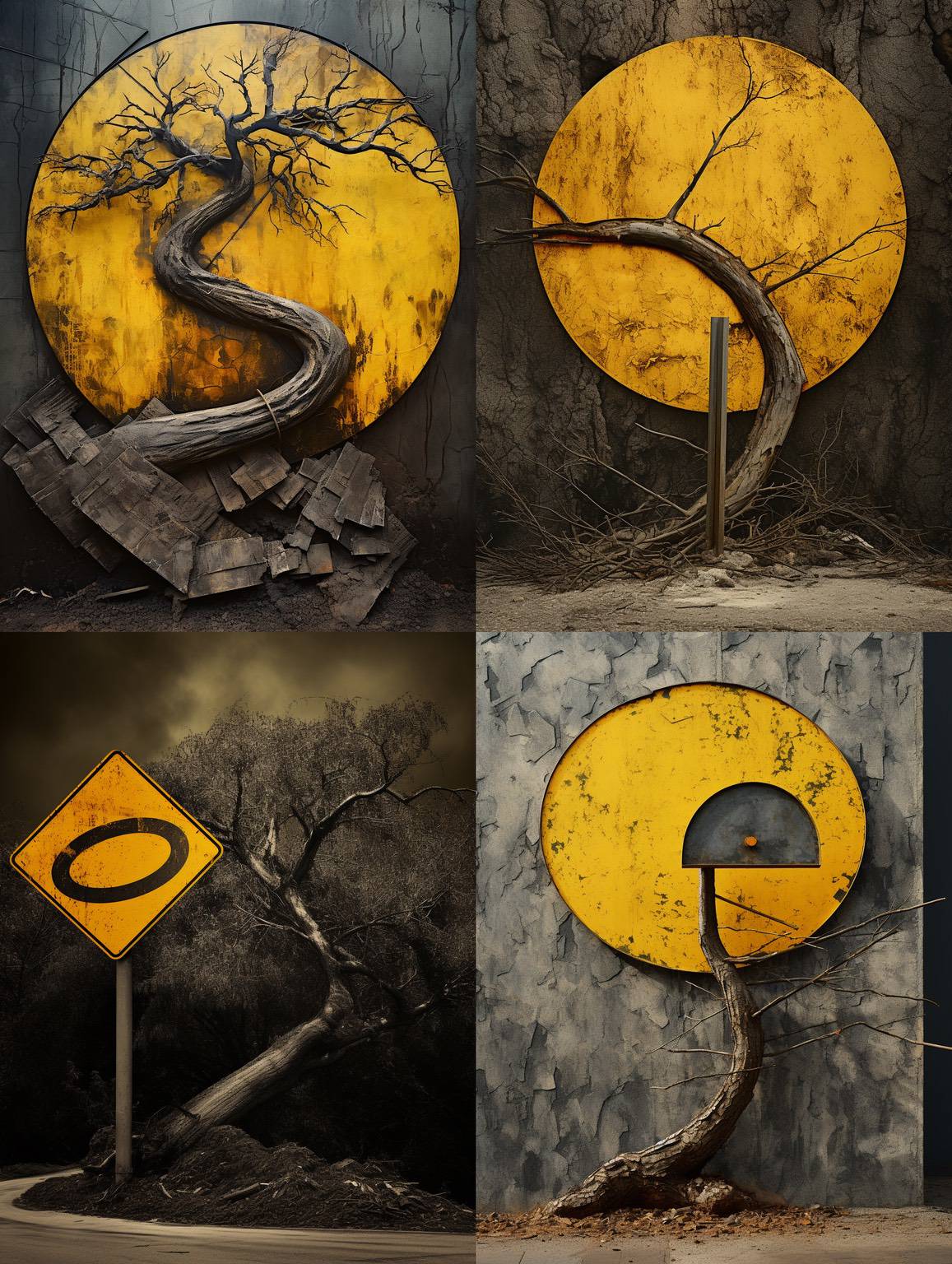
Top left one; the others are discards.
If I were an artist, I can imagine creating something like this, another "imperfect beauty" sort of thing, I suppose. I like the contrast between the gray-brown background and the color pop of the yellow. I really like the whole composition, too.
There's a thin circular band or something around the bottom of the S-curve main branch; I'm not sure I'd keep that or paint it out if I were shipping this.
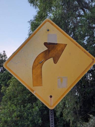
Behind-the-scenes: here's the original photo that was used to inspire Midjourney.
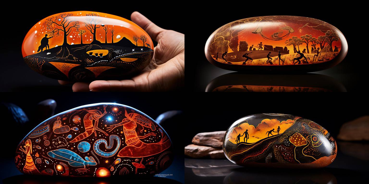
These are all interesting; the lower right one is my favorite.
I like the glossiness and the oval shape, the colors, and the inspiration from Australian Aboriginal art.
It's cool that between ChatGPT and Midjourney, I've ended up with images I would never have thought of; on the other hand, I probably wouldn't ship any of these. But they're interesting to look at, and share with a few folks, in context.
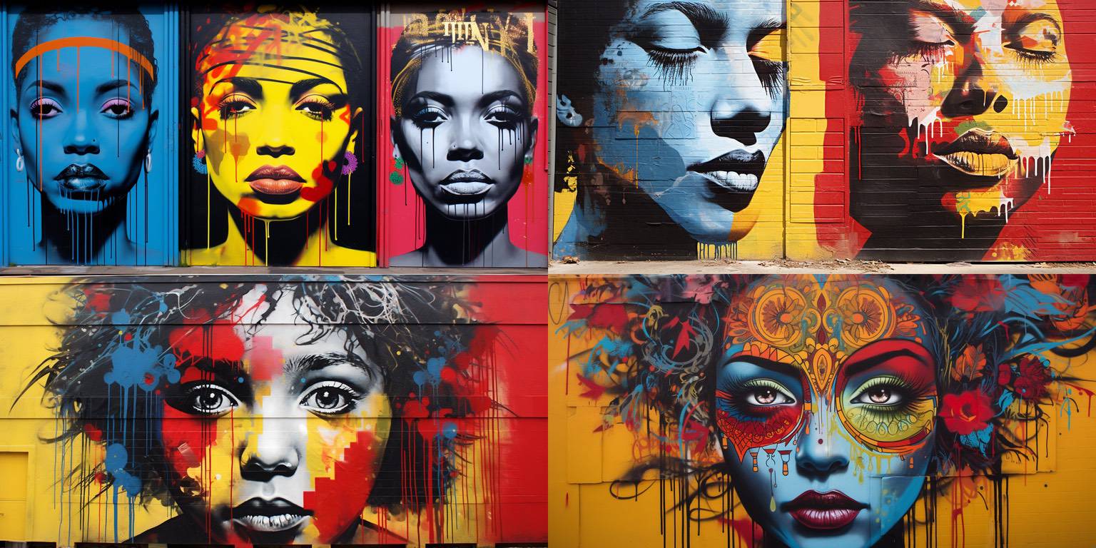
I really like the lower left image. The others are trite or poorly composed, I think, but the lower left one pops, at least for me.
Part of it is the woman's expression; part of it is probably that I'm a sucker for primaries (red, blue, yellow, black, white).
I like how physical the painting looks, too – the horizontal lines of the building panels, and the paint drips from the concentrated spray paint. When I see things like that, I'm reminded that current image generators don't know anything about physics, like "too much paint in one place will cause a stream of paint to run down the wall, due to gravity." It's just that they've seen enough images to know what "street art" looks like, and it has those shapes and appearances, regardless of the physical processes involved that created them.
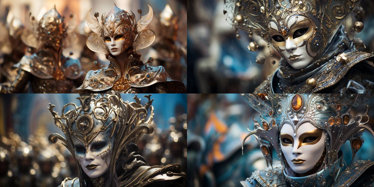
Again, sort of a trite image, but I really like the lower right image. The out-of-focus background, the colors, the shapes, even the composition – I really like it.
(And probably wouldn't often share it, I'd worry about the triteness!)
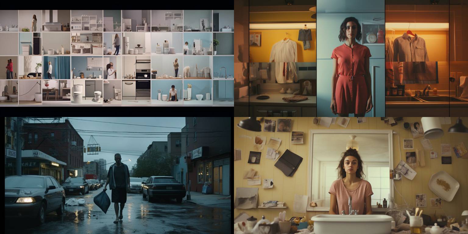
I like "everyday, ordinary" sorts of images, and in this one, I really like the lower right image. It's a combination of the colors and balance of objects, the mirror behind the woman, and her expression and hair.
The other images are not great, and another example of sorting through many images to find the ones you like.
The prompt for this one starts, "video art project that captures the daily routine...."
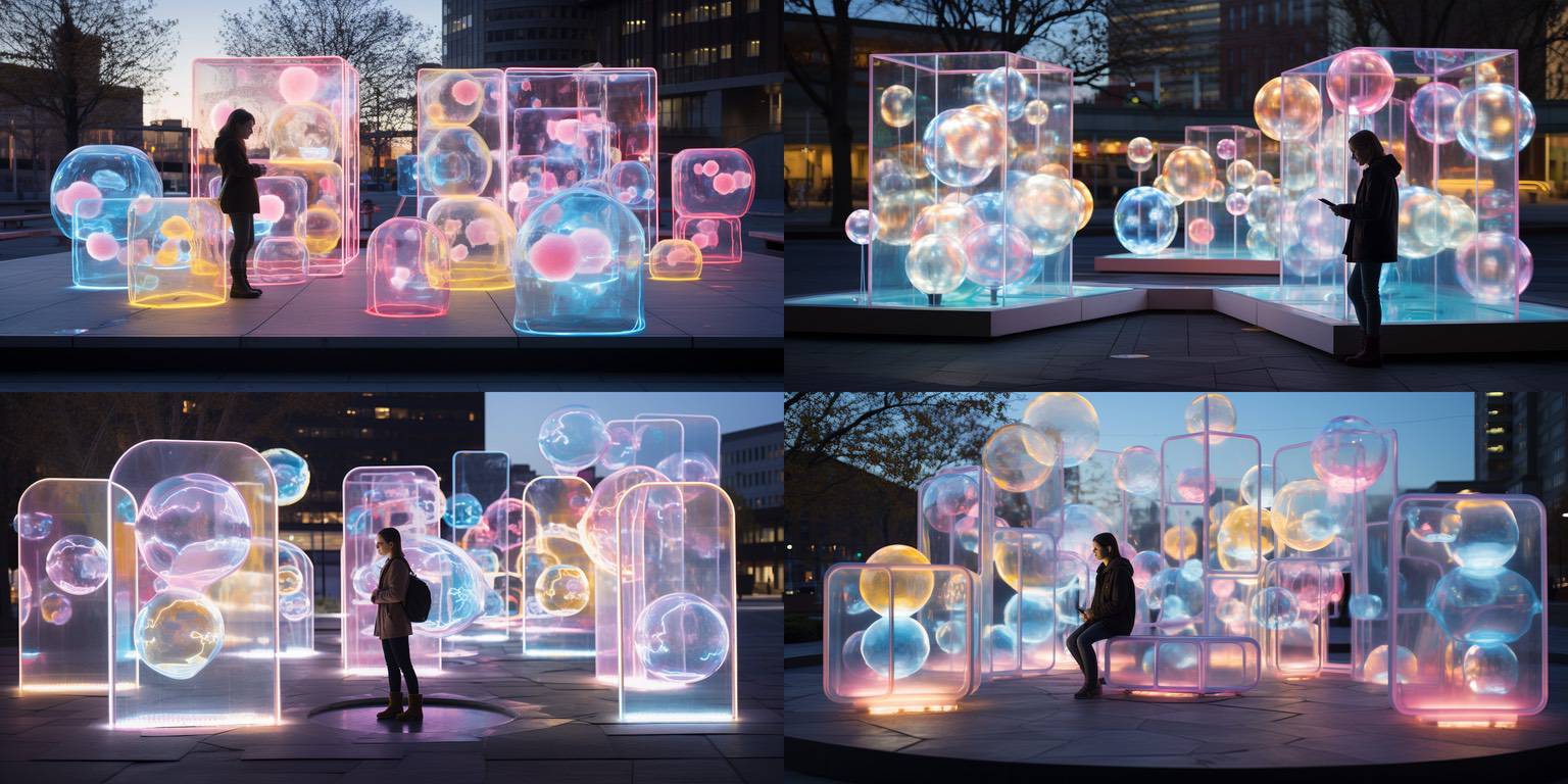
I probably wouldn't ship this one, but it's cute! I like the idea of the translucent bubble / cube art installation, and I like the soft pastel colors.
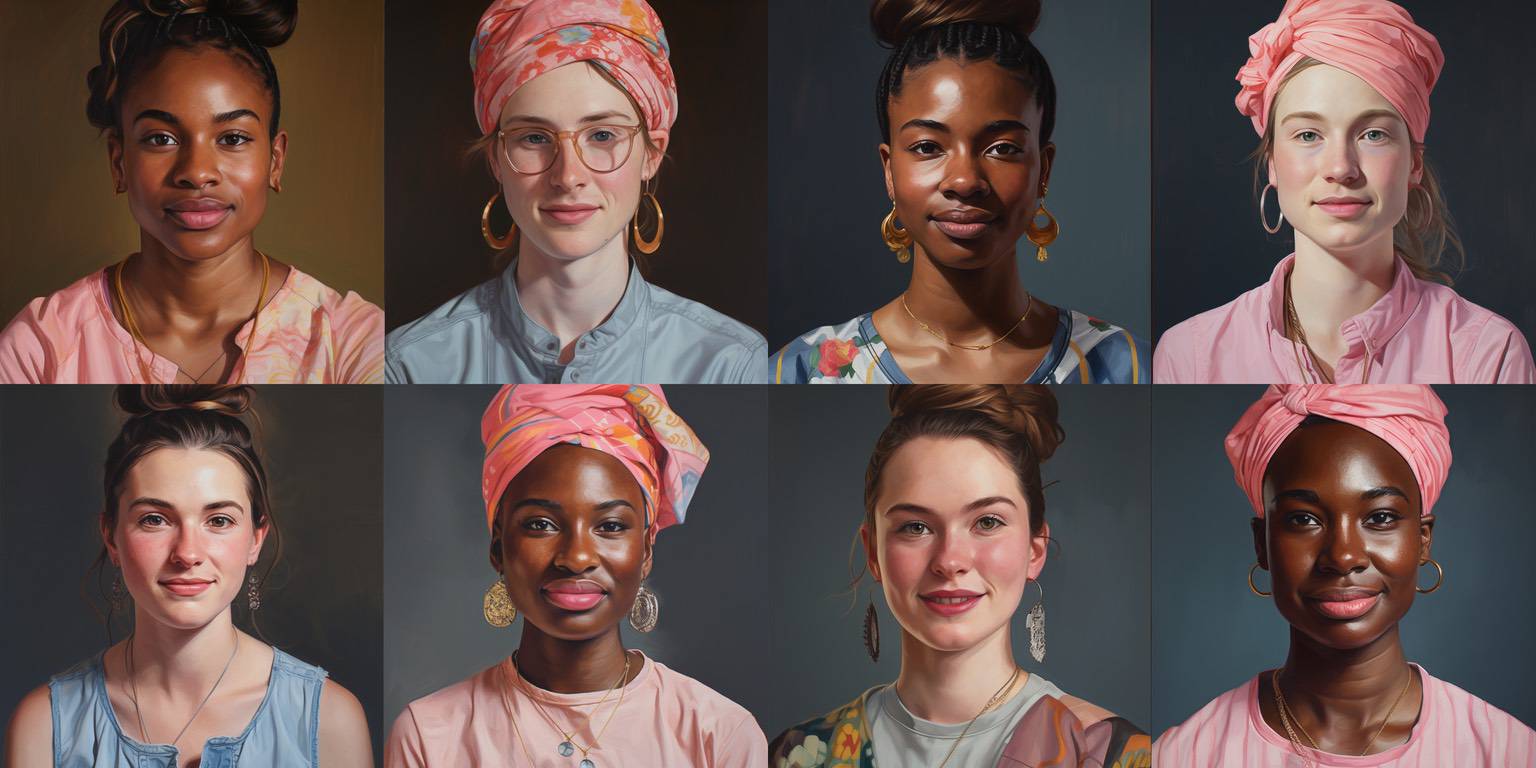
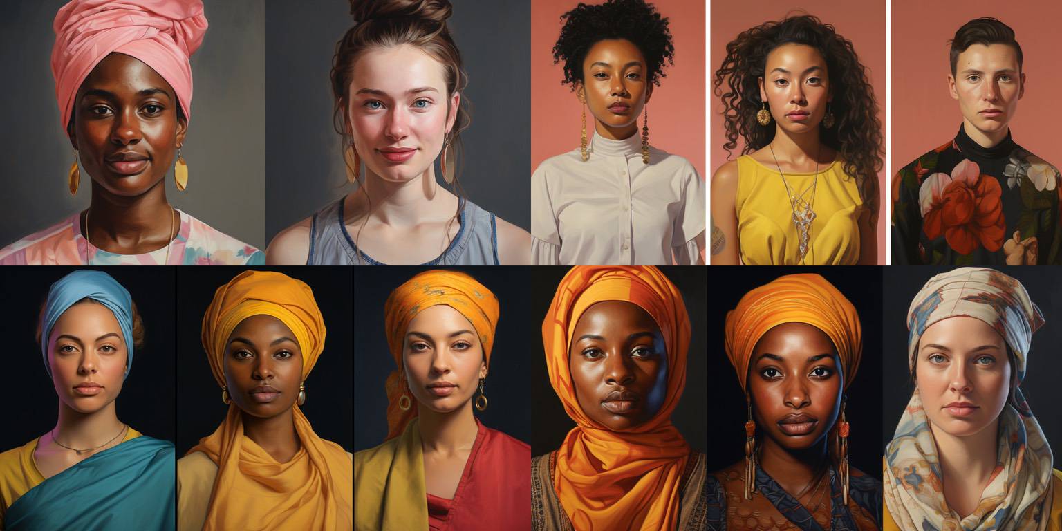
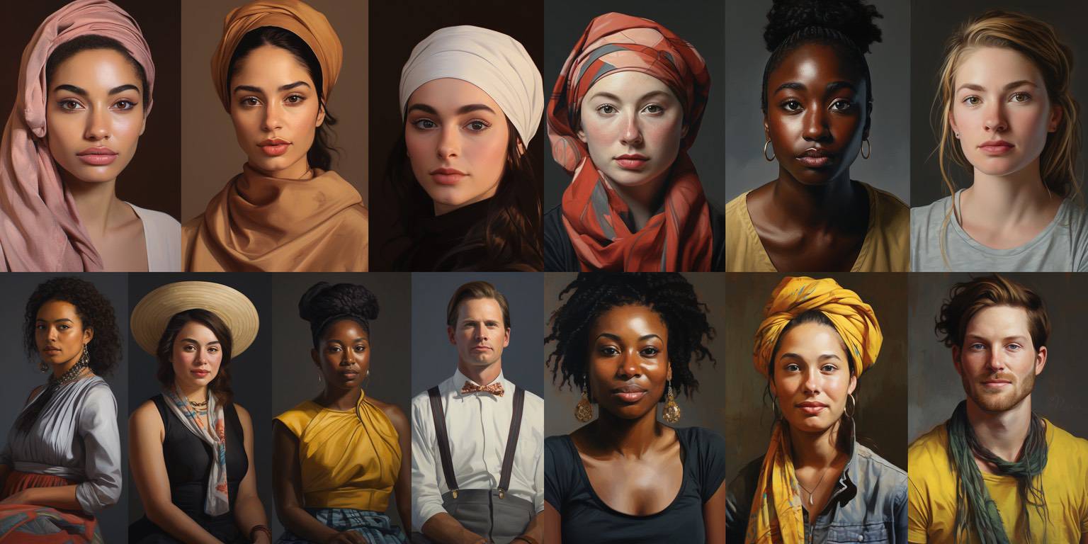
Wow, some striking faces! There's "diversity" in the prompt, too, which accounts for the various cultural and genetic backgrounds. Even though there are some kinds of diversity, in other ways this collection of portraits is not very diverse at all!
The top quad is a set of variations of the top left image from the bottom left quad. The smiles came out quite nice. The contrast in the lighter and darker skin tones is striking, too.
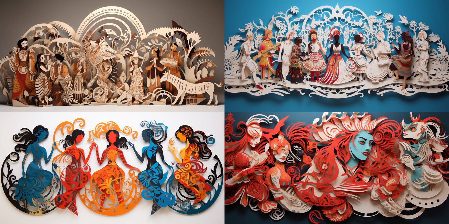
Papercraft is always fun. Here, I like the lower left and upper right images.
In the lower left, a lot of it is the colors, but the shapes are well-done, too.
In the upper right, I like the white background and the composition of all the figures, although if you look carefully, there are many structural defects in the figures.
That white background with all its intricate shapes and overall symmetry is one of the things that still amazes me about the good image synthesizers like Midjourney.
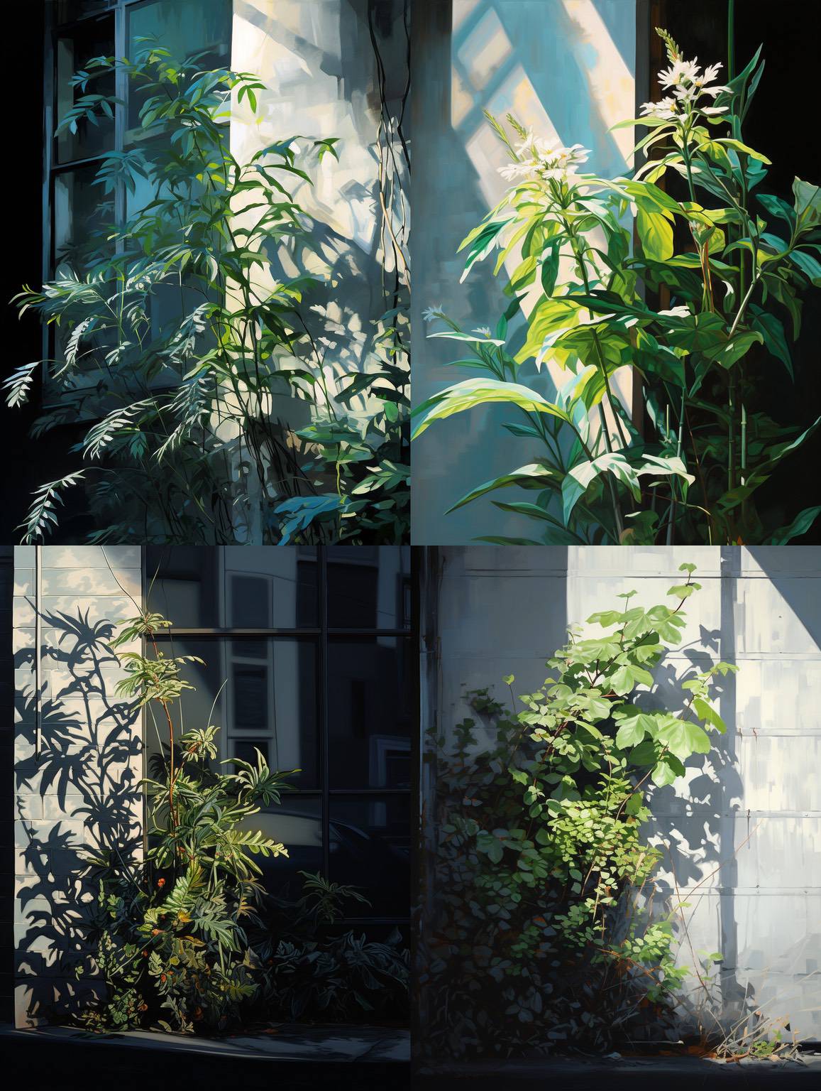
LOL, these are pretty lousy images, I'd judge. However, I very much like the angle and the color of the sunlight and the shadows it casts!
So, something you can't ship, but something to study and learn from.
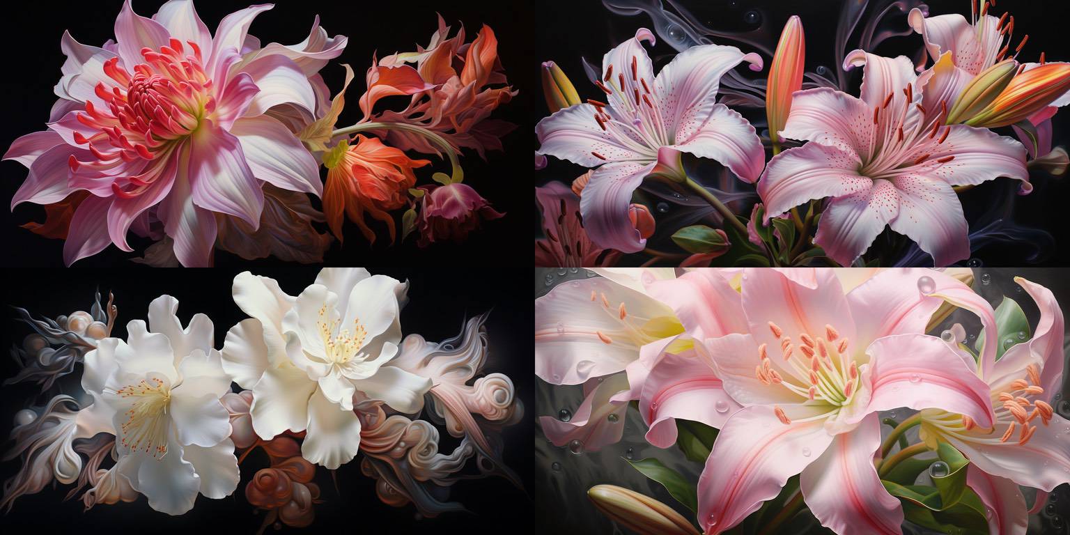
Wow! These are so pretty – I really like them.
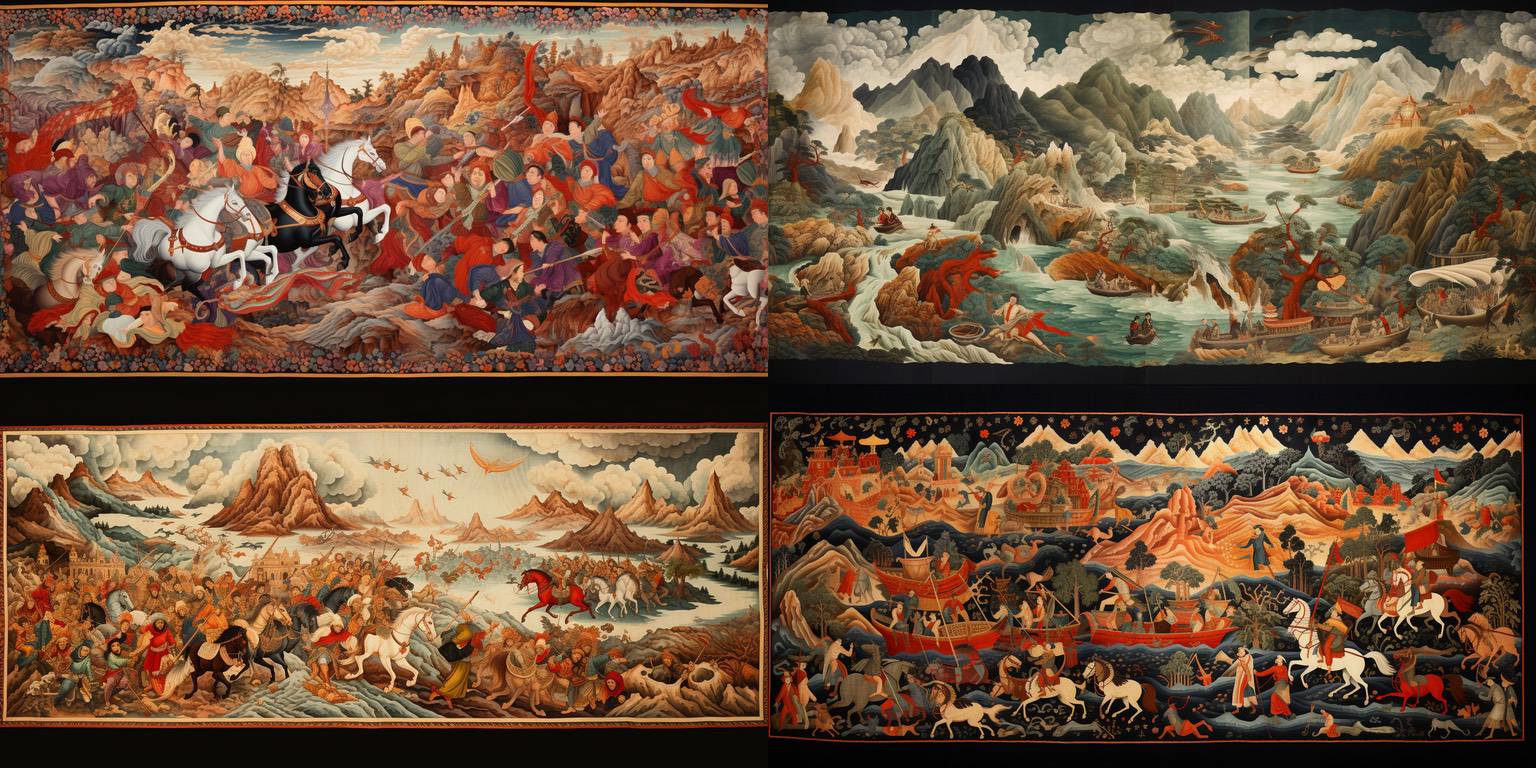
With current generation synthesizers, images with lots of small figure detail like this never look great when seen full-size. However, the overall colors and action look great from a distance. So they're fun to find in your generated images, even if they're not really useable.
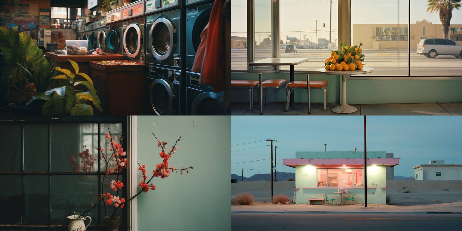
Everyday images! I like all of these, although the first three each have some subject or composition problems. The last, on the bottom right, is either shippable or close to it.
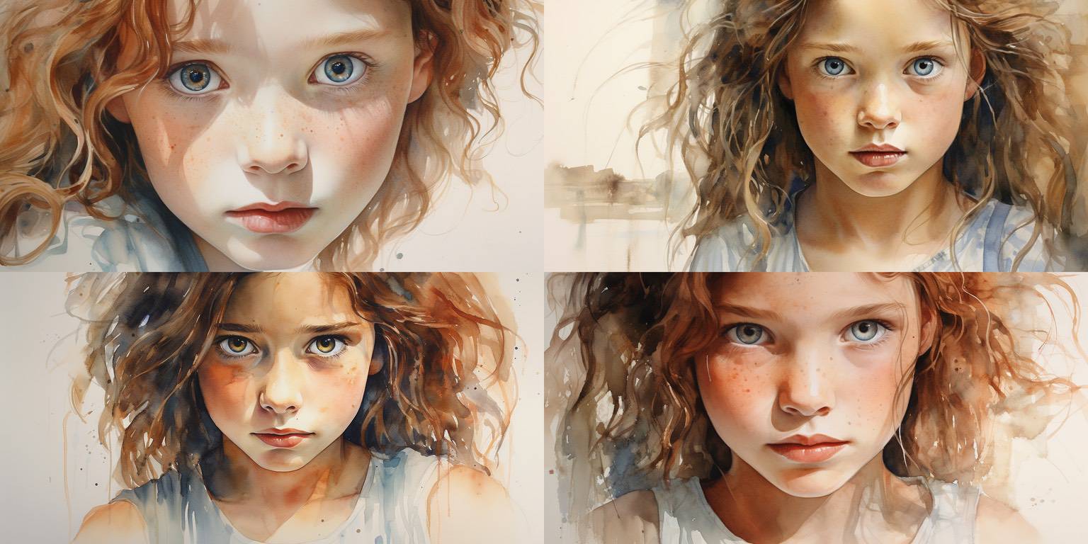
Gorgeous faces are a dime a dozen with Midjourney, and I typically try to stay away from them. I wouldn't have come up with this prompt, but ChatGPT did, so I ran it with the others.
The girl's face is, of course, very nice, but I'm sharing this with you mostly for the delicacy of the watercolor, and the lighting and shading. Super nice.
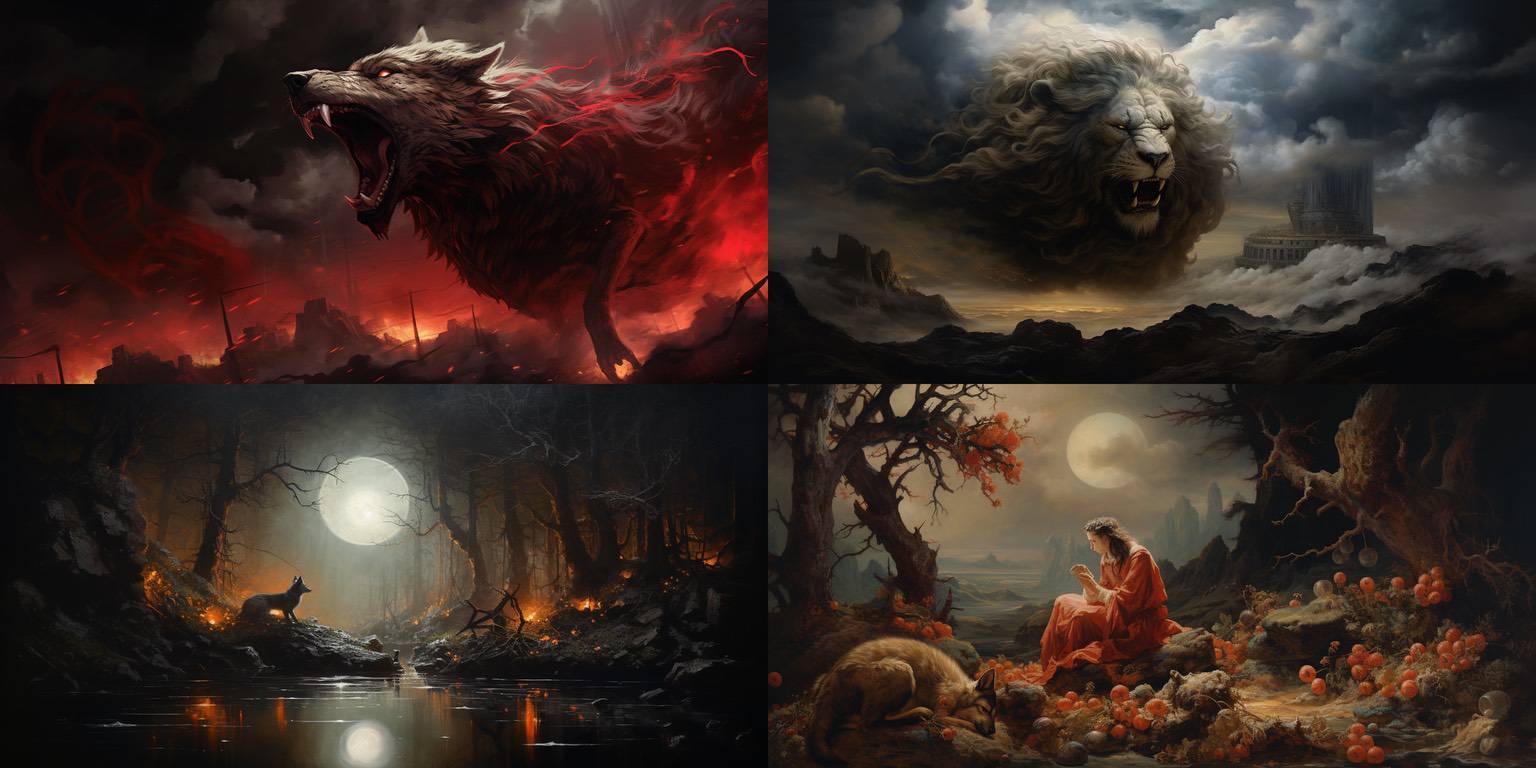
This is sort of a weird one, generated from a semi-random prompt. The wolf is interesting but weird; the lion is sort of cool, although I think he should be threatening something else, I'm not sure what. The moon, fox/wolf and pond is fine, but sort of trite, nothing special. The final one is kind of nice, I think, especially if it were cropped to put the woman in the center.
It doesn't quite work, but each of these has got potential in some way. A common happenstance, and sometimes it's worth trying to further with an image, and sometimes it's not.
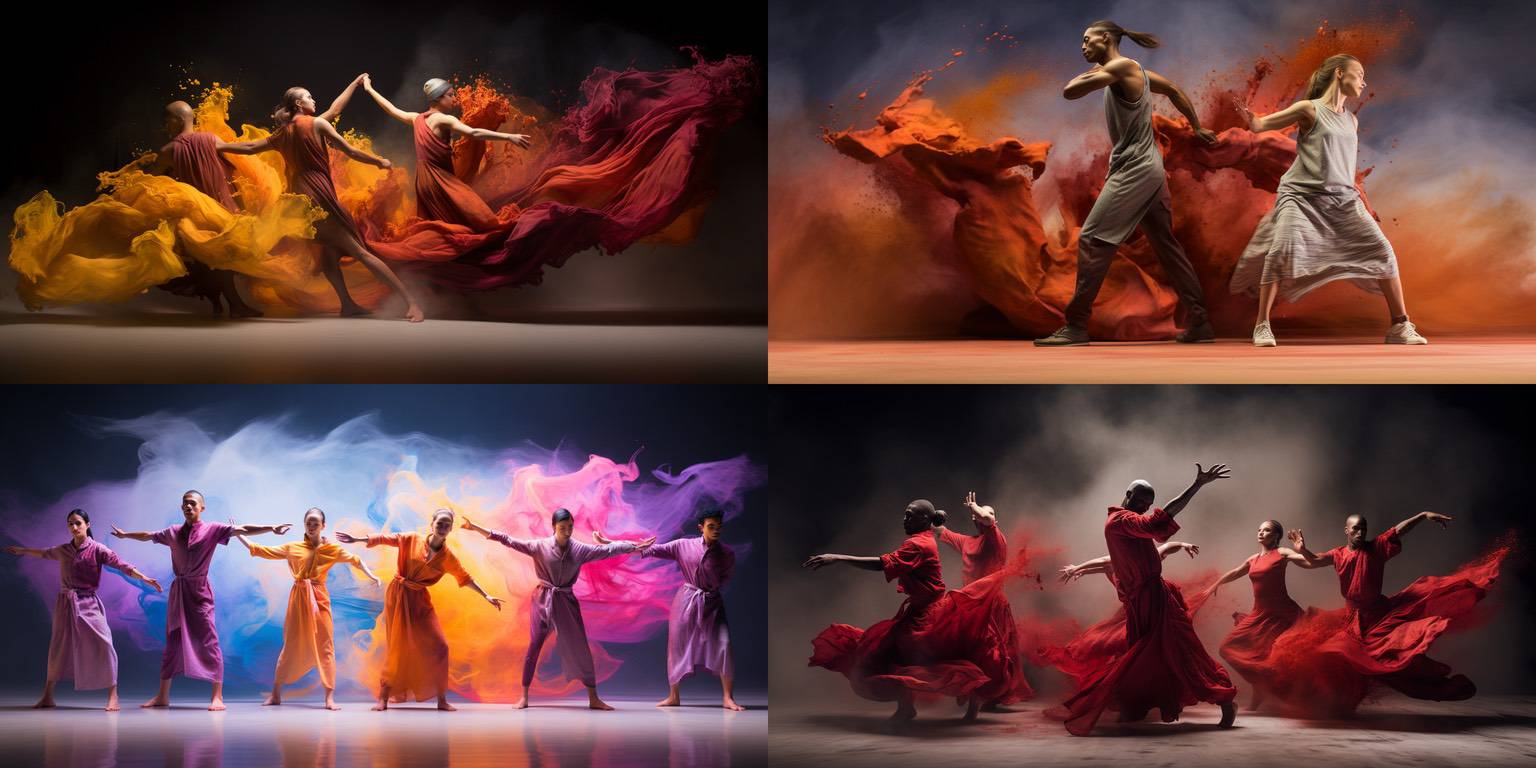
None of these is great, but I love the colors and smoke in the lower left.
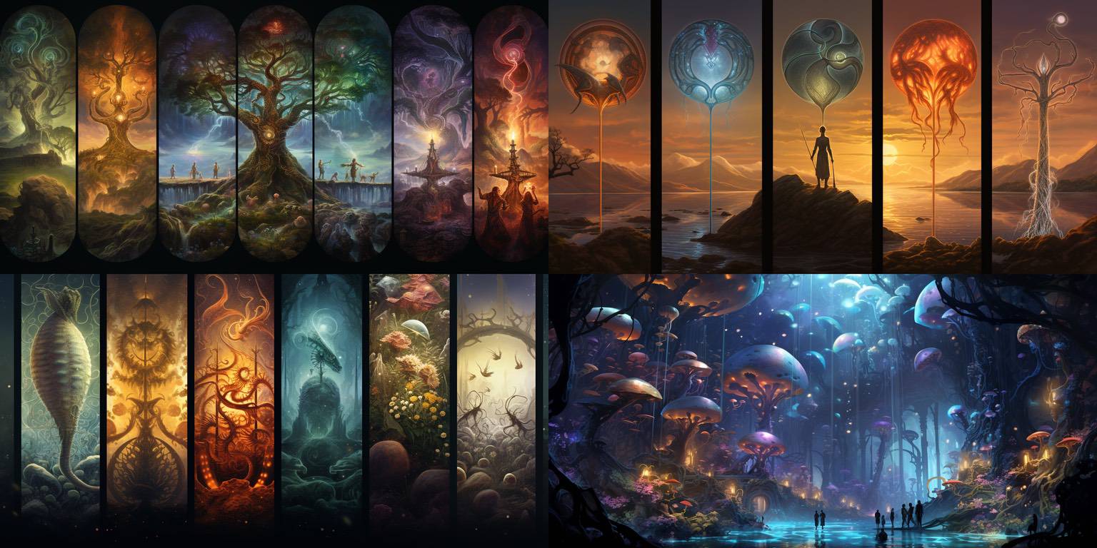
This sort of image is pretty common with random-ish prompts. They're always interesting to peruse; I like when it does panels and delicate colors across the panels.
Generally not shippable because they're so common, but sometimes elements might be repurposed somehow.
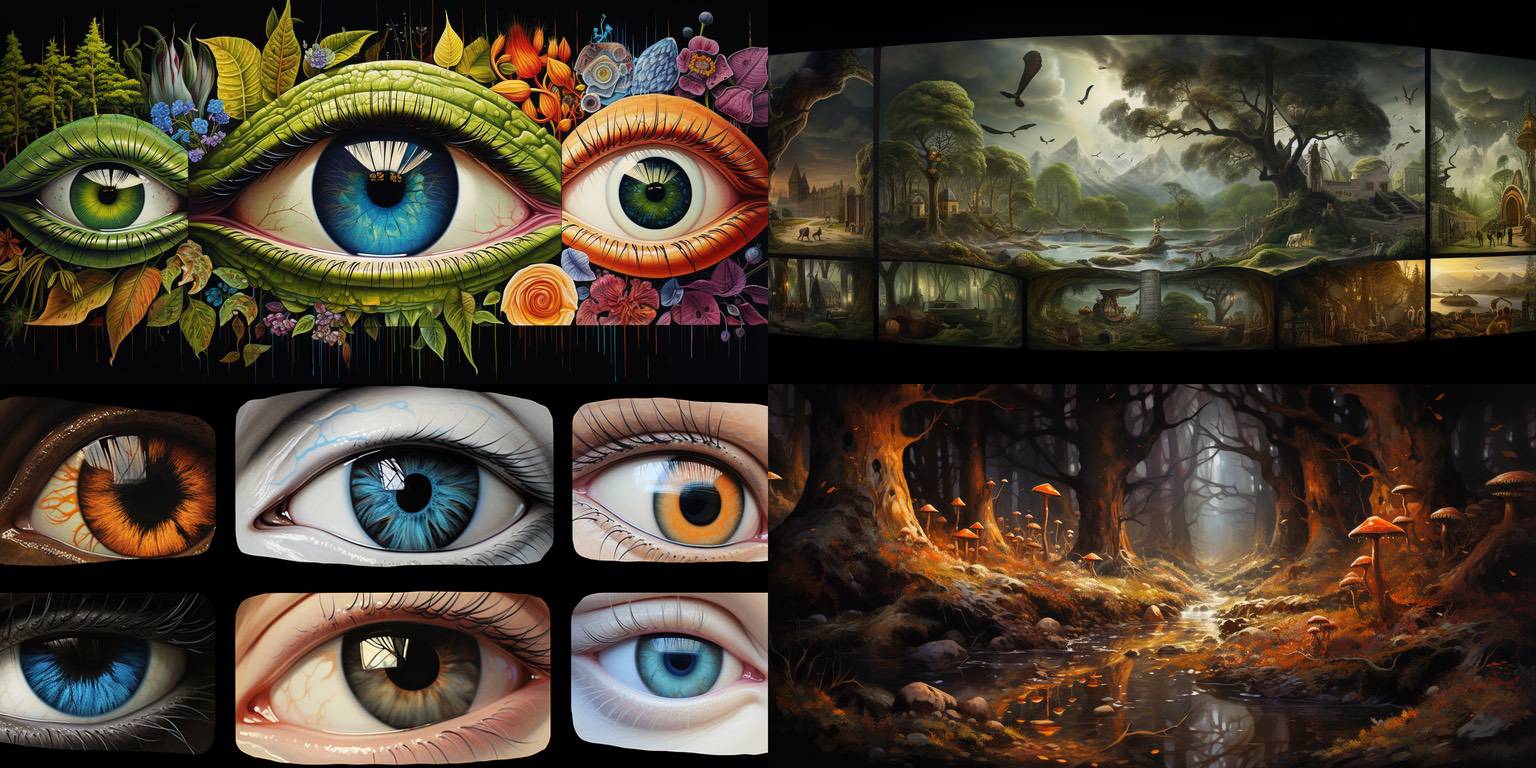
Midjourney is really good with eyes! I'm not sure I'd do anything with these, but good eyes are always fun to find in the generations.
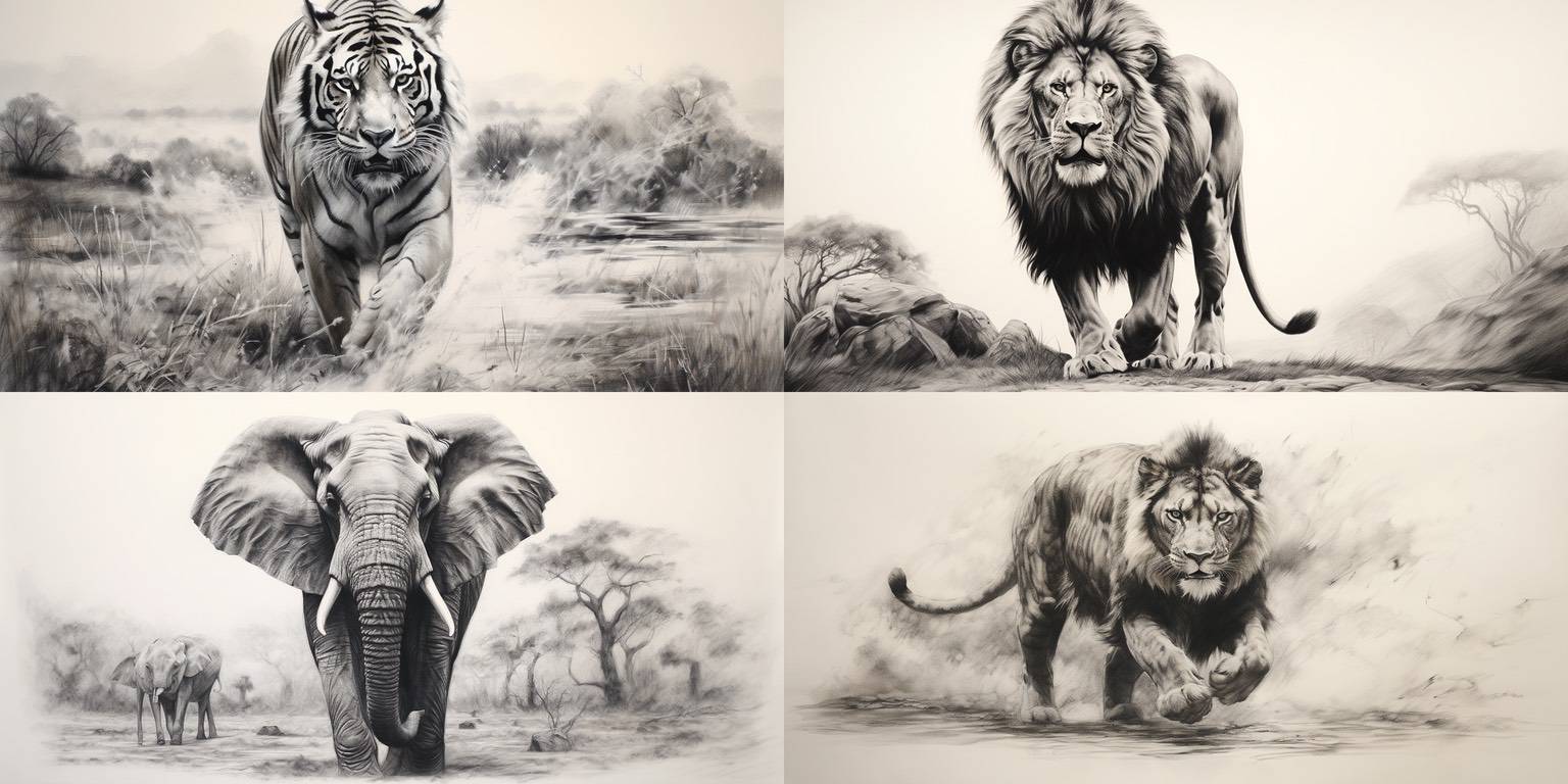
Your basic African mammal charcoal sketches. I like these, and with a little touchup, they might be shippable / usable for something.
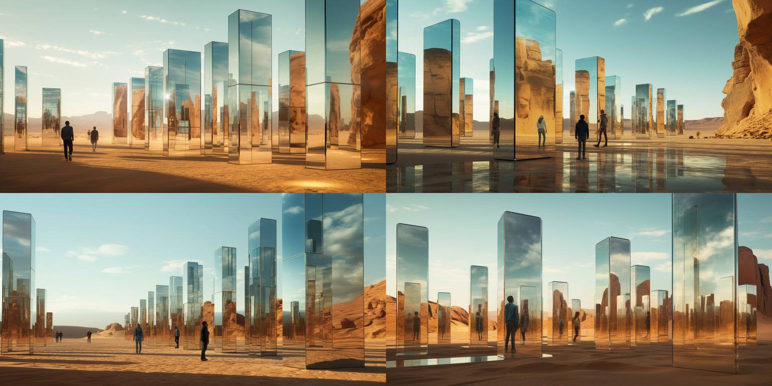
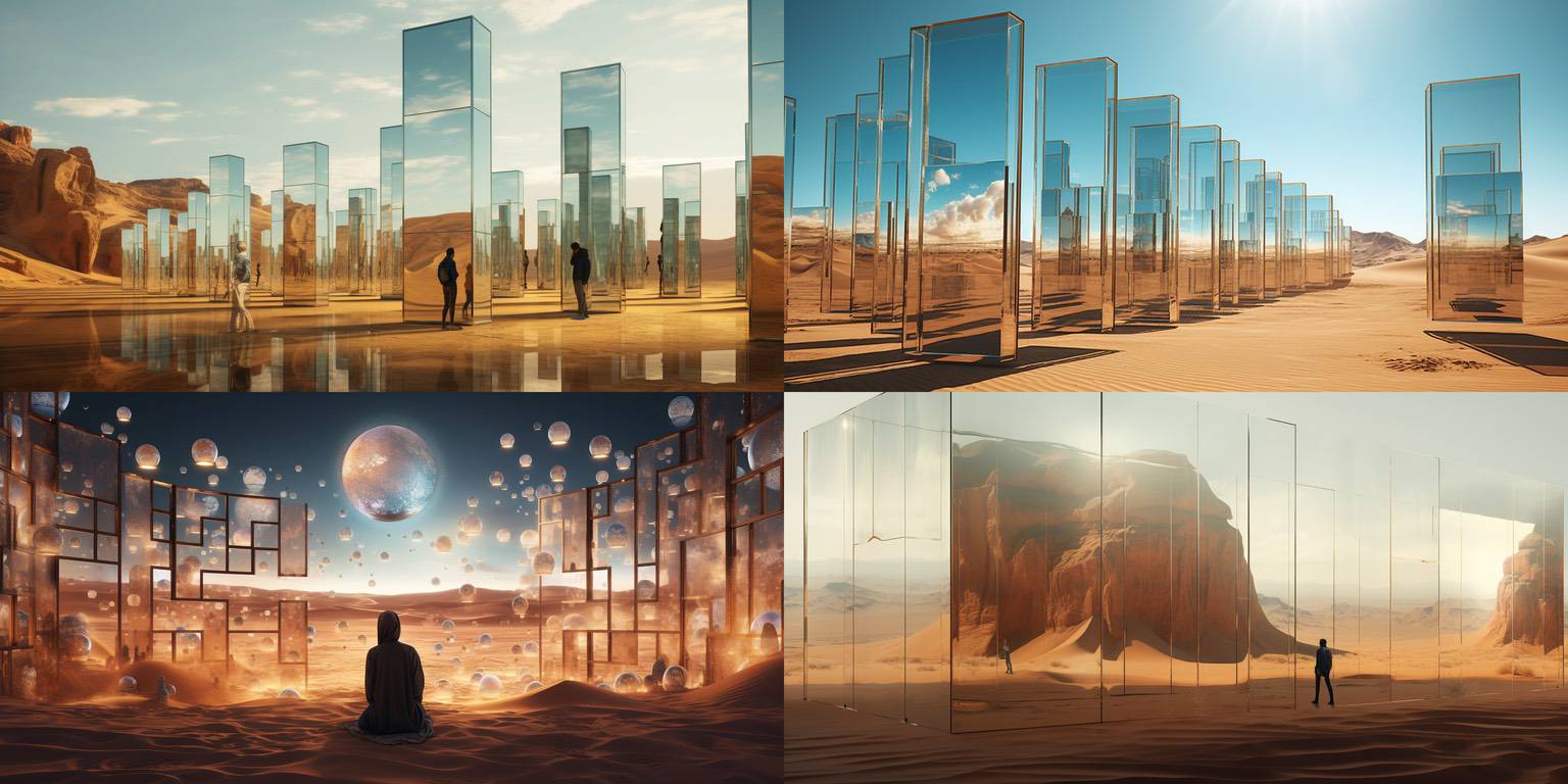
Who doesn't love mirror columns in the desert?
Because of the colors, sunlight, and interesting shape, it would probably be okay to ship a small number of these (one or two, say), chosen from these, and other similar quads generated around the same time.
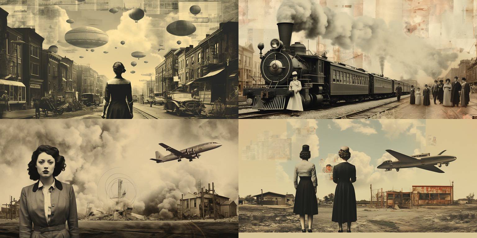
This is a "collage" prompt, so the results are a little chaotic.
I actually like the image in the lower left; I like the composition, the woman's face, and the plane reminds me of one of my favorite planes, the Lockheed Constellation. Midjourney is not particularly good at planes unfortunately. It would take some work – maybe worth it -- to get a better Connie (or something similar) in there.
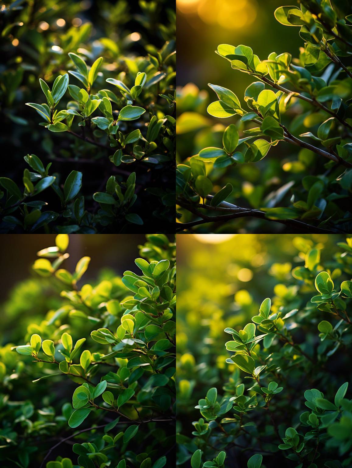
Would you believe it, out of all the images in this post, one of these is one of my very favorites?
It's the top right one. Something about the subject focus, background out of focus, the light, and the colors – it's really satisfying. (It reminds me of when I saw Pixar's A Bug's Life movie, and the shots they had looking up at the underside of leaves.)
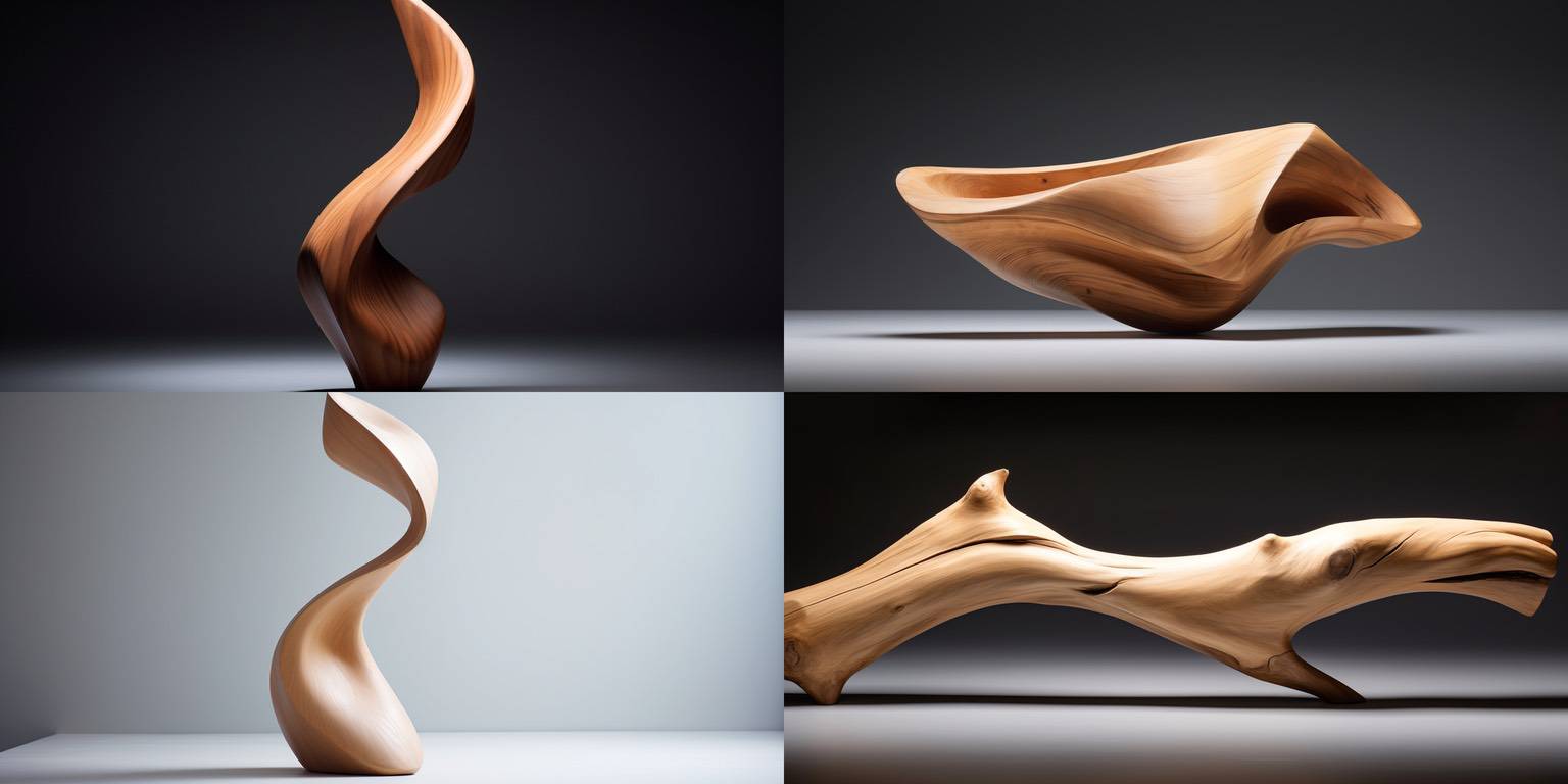
Very basic images, but in these, it's actually the shapes of the wooden sculptures that I find interesting.
When image synthesizers understand what they're making in 3D, it'll be cool to take a shape you like, turn it into a 3D model, then spin it around the way you want and re-render (hopefully in realtime).
Of these, I like the one in the lower left for some reason.
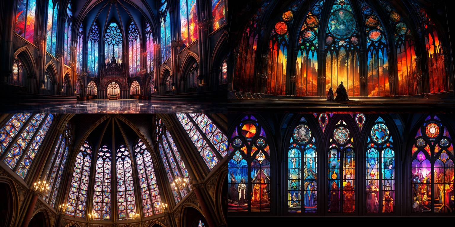
I love colorful stained glass images, and these are great. I'm starting to get too many of them, though! I'll have to find a way to make them different.
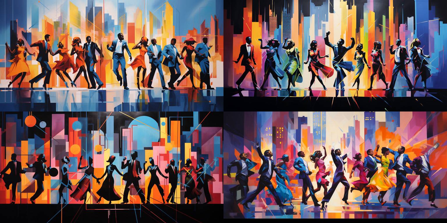
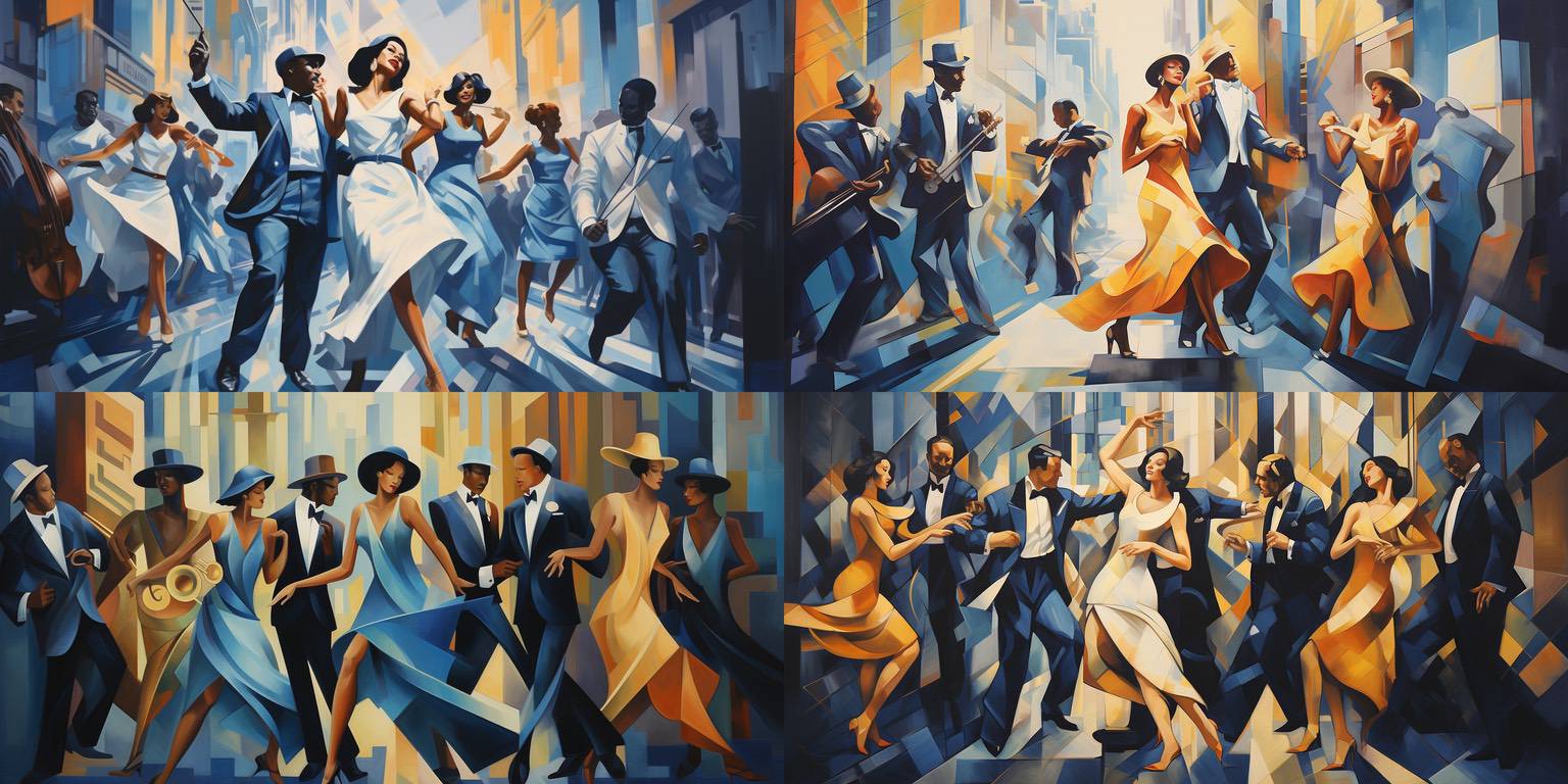
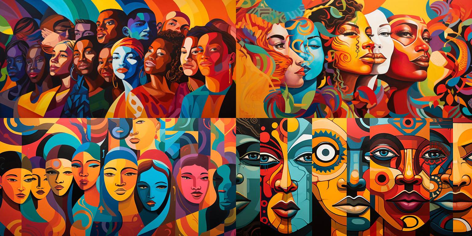
I love the composition, energy, and color in these murals. A couple might be shippable, it's sort of a judgement call.
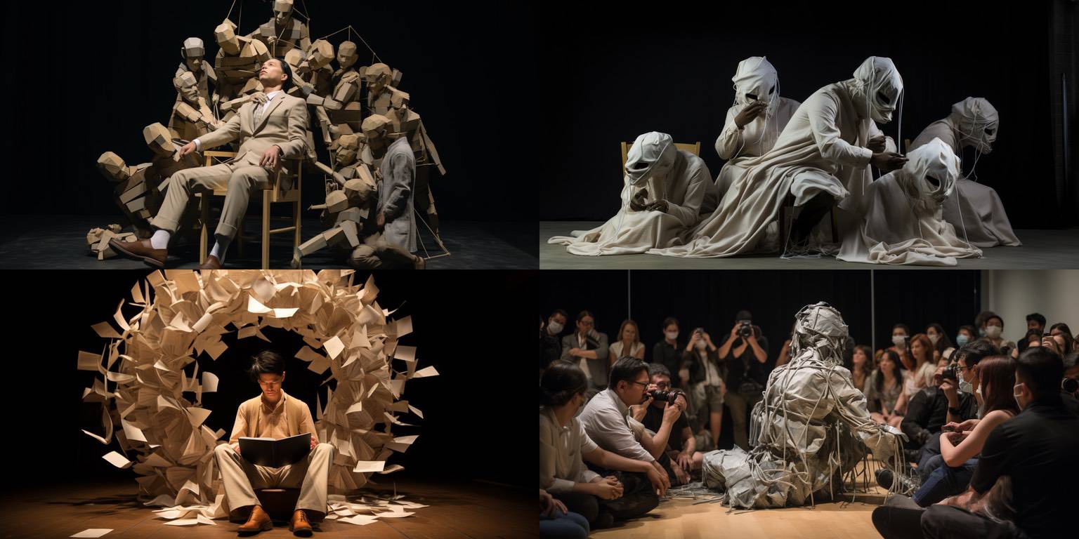
Performance art pieces. I like the left two! They might be useable with a few tweaks. I think the right two are creepy, so I haven't even really looked at them, lol.
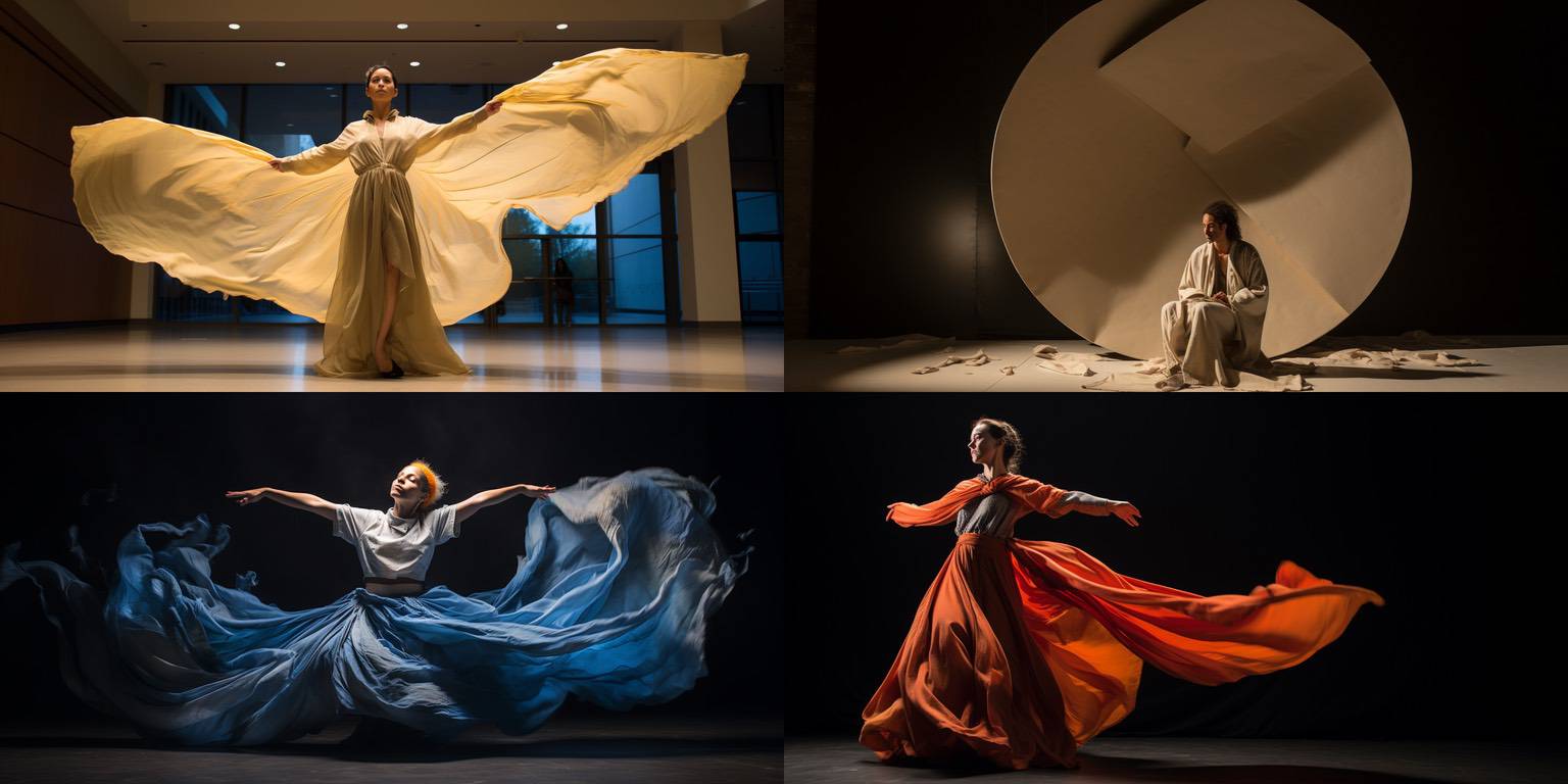
I really like the flowing cloth and colors in the top left, bottom left, and bottom right. The top right does nothing for me. :-)
I tend to not even think of shipping dance figures, they're overrepresented, I think. But these might have potential.
And there you have it, a day in the life of a Midjourney wrangler. Watch the 18 October Plex for the announcement of how to subscribe for more Midjourney content like this, and in the meantime, check out some older galleries of "shipped" images at Pixelthesia.ai – Pete